Start with the services grid
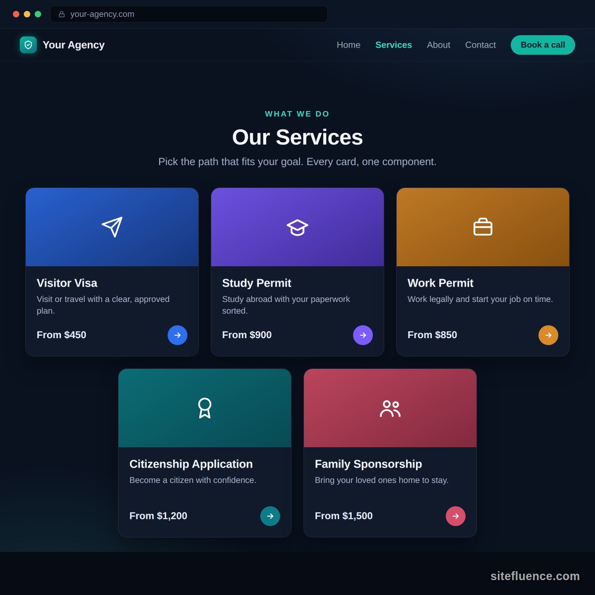
Say you run an immigration agency. Your homepage has a Services section: a tidy grid of cards. Visitor Visa. Study Permit. Citizenship Application. Five of them, lined up. You feel like you owe your agency a document describing all five, a spec covering every color, feature, and half-formed wish. You do not. Every card is the same shape wearing different words.
Your site is a box of repeating parts
Here is the reframe. A website is not one giant thing to describe. It is a set of components: a hero, a form, a pricing table, that services grid. Each is separable, and the good news is they repeat. Those five service cards are one component wearing five outfits. So you do not spec five cards. You spec the shape of a card, once.
Give every component a one-pager
Once you can see the parts, describe each one on a single page. Not a spec, a brief: a few short sections your agency can read in two minutes and turn into backlog items you control. Here is the whole page, written out for the service card. Steal the shape for every component you own.
-
The gist. A grid of cards on the homepage, one per service. Each card sells one service at a glance and takes the visitor to that service's page.
-
Where it lives, and who does what.
- On the public site: the services grid on the homepage.
- In the admin: a screen where you add, edit, hide, and reorder cards yourself, no developer needed.
- The agency builds both sides. You write the words.
-
What goes on a card.
On the card What it is Title Short text, the name people click Selling line Short text, one sentence that sells it Photo An image Brand color A color, as a hex like #0E7C86 Price Short text, "From $1,200" or "Contact us" Link The page the card opens -
When a card earns its spot.
- No title, no card. A card without a name has lost its meaning, so hide it.
- Missing the photo? Fill that space with the brand color.
- A card with no destination yet can stay visible, it just goes nowhere.
- And if every card is hidden, the homepage skips the grid entirely.
-
How it should feel.
- Tapping anywhere on the card, photo or text, opens the service page.
- A slight lift and shadow on hover, enough to invite the click, nothing theatrical.
-
Room to grow. Flag what might change someday: a sixth service will arrive eventually, and the photo could become a short looping clip. One heads-up line each, not a requirement.
-
How many fit a row.
Screen Cards in a row Phone 1 Tablet 2 Desktop 3 -
The picture. Staple on a napkin sketch, a screenshot of a site that got it right, anything visual. More on that below.
-
What the page leaves out. Anything about how to build it: no frameworks, no animation libraries, no pixel measurements. The how is your agency's half of the deal.
Fill in exactly one, completely
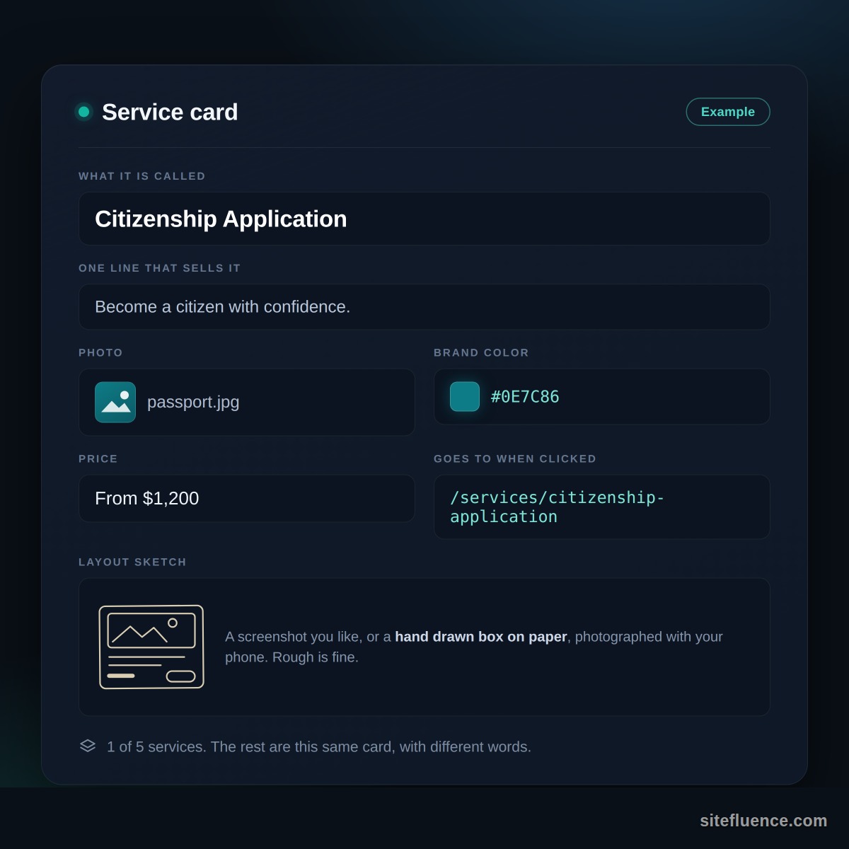
So do it for real, once. Card: Citizenship Application. Sells it: "Become a citizen with confidence." Photo of a passport. Color #0E7C86. Price: From $1,200. Clicking it lands on /services/citizenship-application. The hero image below shows that one card, fully filled in, so you can hand it over instead of describing it in prose. The other four are this card with different words.
Then hand over a picture
Words drift; pictures do not. Grab a napkin, sketch where the photo sits, where the title goes, where the price lands. Photograph it with your phone. A crooked hand-drawn box beats three careful paragraphs about spacing, and it takes ninety seconds. If a card later shows up wrong, that same instinct powers a clean bug report your agency will act on.
The whole move in one line
Break the site into repeating parts, give each part a one-pager, fill in one example completely, and photograph a rough sketch of the rest. You are not writing a spec, you are handing over an example clear enough to copy. Do that per component and the overwhelm evaporates, one card at a time. It is the same move that runs through this whole series: show, do not tell.